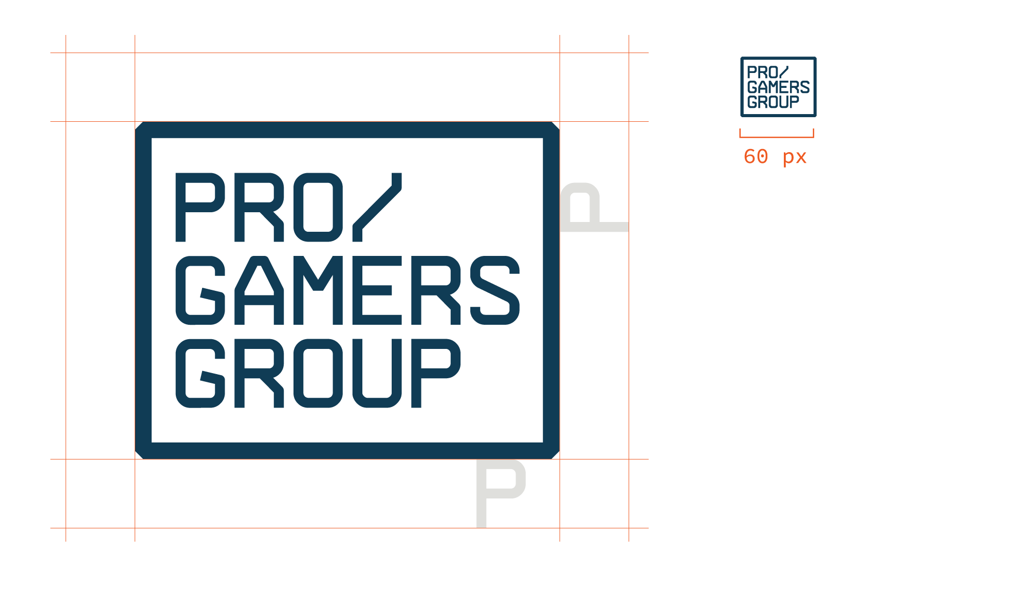
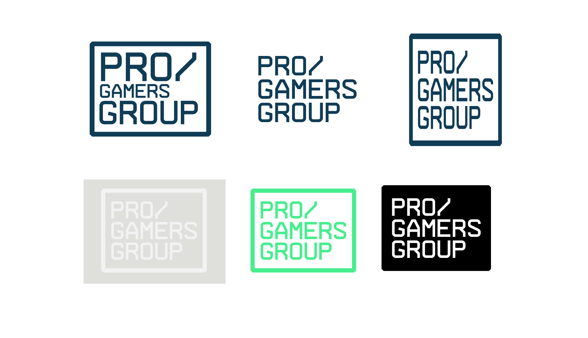
WE ARE BRAND BUILDERS

This is our brand platform and the foundation for our identity as a company.

INTRODUCTION

Brand Guide
In this brandguide you will be guided through the core elements in our brand. The aim of the guide is to assist you when using and communicating with these elements. That way, the brand is communicated with consistency and instant recognition.

The brand should be instantly recognized.
Concept
The brand concept is contemporary and futuristic. The brand should be versatile, business orientated, bold and professional with highly data driven clear visuals.

A clean layout and sober colors combined with powerful imagery creates a strong brand foundation.
Platform
Our brand should signal market leadership, exceptional brand-building with a highly attractive financial profile built on a passion for gaming and a gaming lifestyle.

This brand platform is the foundation for an identity that can last for years to come.
We are
Gamers
We are
INNOVATORS
We are
GLOBAL
We are
UNSTOPPABLE

OUR BRAND

The Pro Gamers Group Brand should clearly communicate our vision and our mission. Pro Gamers Group is the only vertically integrated, digital narrative PG Gaming and streaming player. From inspiration to development - Sold through B2B and B2C.

OUR VISION

To be the global leader of immersive gaming experience products.

Our Mission

To create an unprecedented gaming experience.

Our HISTORY

Since its founding in 2003, Pro Gamers Group has developed into one of Europe‘s most successful online providers of computer products and custom services. Currently our employee base is more than 400 people across the globe, and continuously growing.

CUSTOMER LOVE

Our dedicated team strive every day for the greatest possible customer satisfaction - both B2C or B2B.

As a group, we create unique and engaging social content in nine different languages for our communities all over the world.

Our Logo

The logo is our signature and we use it across all our communications. For it to be recognizable, consistency is important (don’t edit, change, distort or recolor it).

x-game focus & energy sales people

PRIMARY VERSION

Our logotype is the most important graphic element.

It’s main function is to act as sender for all our activities and can always represent our brand on its own. The logotype consists of a boxed wordmark which is used throughout all our communications.

x-game focus & energy sales people

LOGO VERSIONS

The logo must appear legibly on a clear background. The logotype should primarily be used in Blue #2 color.

There is an alternative horizontal logo that should only be used when the Primary version cannot be used or seen properly.

The secondary colour, Gray #1, is used in communication and marketing units where the blue version can’t be used.

x-game focus & energy sales people

SIZE AND PLACEMENT

The logotype must be used to be easily recognized and read.

To protect clarity and visual integrity, it should be used with its exclusion zone. The “p” in the wordmark is to be used as guide.

The logotype should always be positioned so that good contrast and generous clearance to other elements are achieved.

x-game focus & energy sales people

INCORRECT LOGOS

The logo must appear legibly on a clear background. Don’t change the logo appearance, add or remove elements, change colors or distort the logo.

Always scale the logo uniformly.

Typography

The primary fonts are Kanit and Inter (both bold + regular) with support by Source Code pro as a monospaced font. All fonts are available as from google fonts with Open Source licenses.

The typography is the visual language of the brand. It is important to always use the correct typeface when communicating.

x-game focus & energy sales people

Primary Headline Font

Kanit is our main headline font mixing a Humanist Sans Serif motif with the curves of Capsulated Geometric styles that makes it suitable for various uses, contemporary and futuristic.

Always use the headline font in all caps with tight spacing and line height.

Download font

x-game focus & energy sales people

Primary Text Font

Inter is a variable font family carefully crafted & designed for computer screens.

Inter features a tall x-height to aid in readability of mixed-case and lower-case text. Several OpenType features are provided as well, like contextual alternates that adjusts punctuation depending on the shape of surrounding glyphs, slashed zero for when you need to disambiguate “0” from “o”, tabular numbers, etc.

Download font

x-game focus & energy sales people

Primary Numbers & Data Font

Inter is further used for all numbers and data for maximum legibility. Use appropriate weights depending on size for maximum readability and contrast.

Download font

x-game focus & energy sales people

COMPLEMENTARY FONT

We have a secondary font which we use to create graphic elements and writing short sentences and quotes.

Source Code preserves the design features and vertical proportions of Source Sans, but alters the glyph widths so that they are uniform across all glyphs and weights.

Download font

Web typography

H1 - Pro Gamers Group

H2 - Pro Gamers Group

H3 - Pro Gamers Group

NUMBERS - 400+

HERO P / QUOTE - Lorem ipsum dolor sit amet, consectetur adipisicing elit, sed do eiusmod tempor incididunt ut labore et dolore magna aliqua.

P - Lorem ipsum dolor sit amet, consectetur adipisicing elit, sed do eiusmod tempor incididunt ut labore et dolore magna aliqua. Ut enim ad minim veniam, quis nostrud exercitation ullamco laboris nisi ut aliquip ex ea commodo consequat. Duis aute irure dolor in reprehenderit in voluptate velit esse cillum dolore eu fugiat nulla pariatur. Excepteur sint occaecat cupidatat non proident, sunt in culpa qui officia deserunt mollit anim id est laborum.

LINK - Lorem ipsum dolor sit.

Colors

Consistent use of colour is one of the easiest & most effective ways to communicate the brand. Blue shades is the signature colors with Blue #2 as primary color with a stand-out red color for CTA, attentive info and a warm gray as a complement color.

PRIMARY COLOURS

Blue #1
#1a253a
rgb(26,37,58)
cmyk(55,36,0,77)

Blue #2
#133B54
rgb(19,59,84)
cmyk(77,30,0,67)

Blue #3
#376ea3
rgb(55,110,163)
cmyk(66,33,0,36)

Blue #4
#58a4d7
rgb(88,164,215)
cmyk(59,24,0,16)

Secondary COLOURS

Blue #5
#84d2f6
rgb(132,210,246)
cmyk(46,15,0,4)

Blue #6
#91e4f7
rgb(145,228,247)
cmyk(41,8,0,3)

Red #1
#ef5a22
rgb(239,90,34)
cmyk(0,62,86,6)

Gray #1
#dfdfdc
rgb(88,164,215)
cmyk(59,24,0,16)

“Our identity consists of several elements, which, when used together, creates a recognisable brand.”

PHOTOGRAPHY

Our photography represent and enhance the brand and communicate values. Here you can find the primary types of images and photography guidelines.

Photo Guidelines/SELECTING IMAGES

Always show people interacting with each other and products (unless it’s a pure product shot.) Make sure they look happy and show positive signals. Always (always) use quality pictures.


Yes! Happy emotions positive signals

No! Sad emotions or negative signals

Checklist

Photos that are not pure product shots should contain 1 or more of the following criteria:

People in motion
In the process of moving around or doing a physical body expression (cheer, point e t c.)

People showing emotion
Happy emotions that shows joy, excitement and similar.

People with focus

Good PHOTO SELECTION

Happy emotions and reactions, Focused action, Good Quality Picture

Bad PHOTO SELECTION

Empty spaces, No “connection”, Far away, Bad quality

EMAIL SIGNATURE

Use a consistent look and structure for the email signature. It can be used in a range from full content to minimalistic.

Short signature:


Long signature:

Downloads

Always use correct versions of logos and images. Here you can find approved version of the logo.

© Pro Gamers Group 2025